

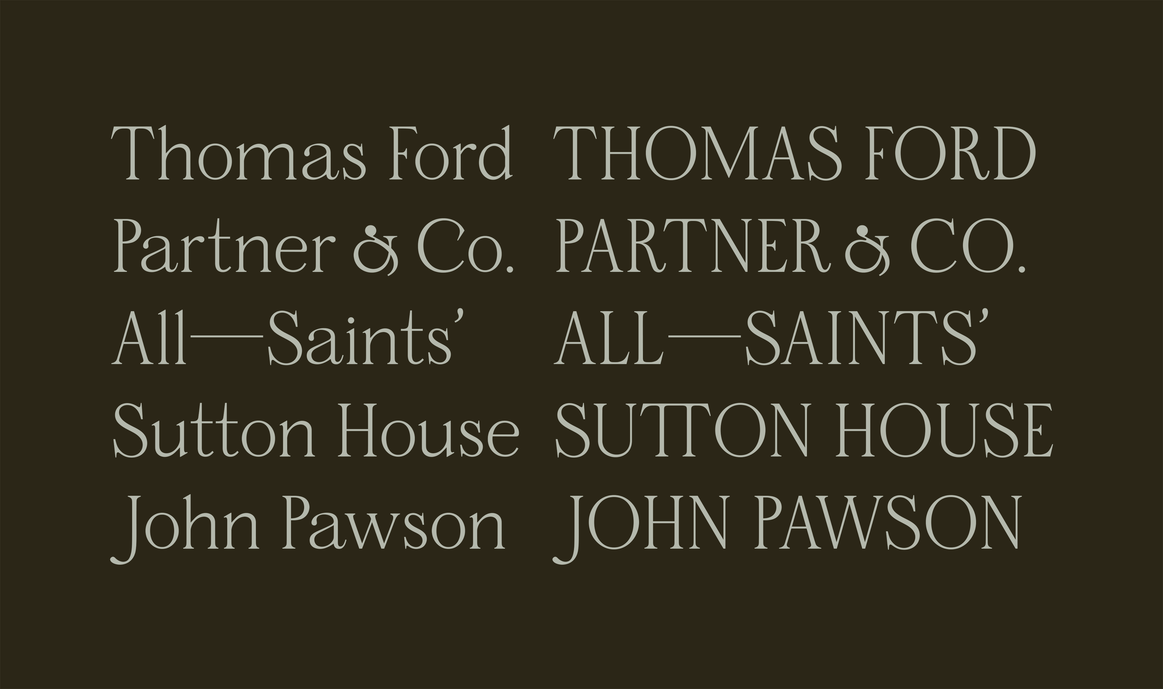
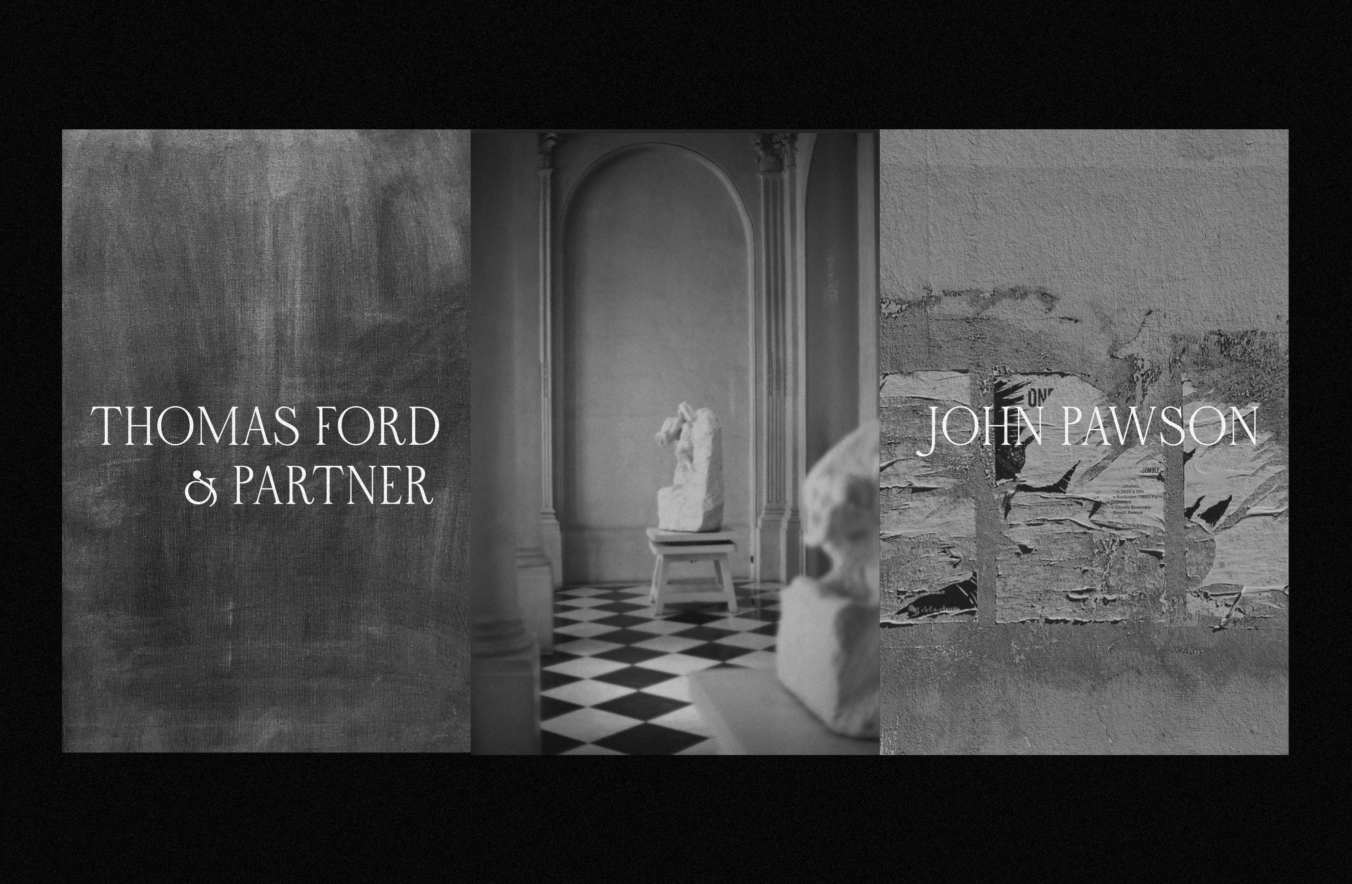
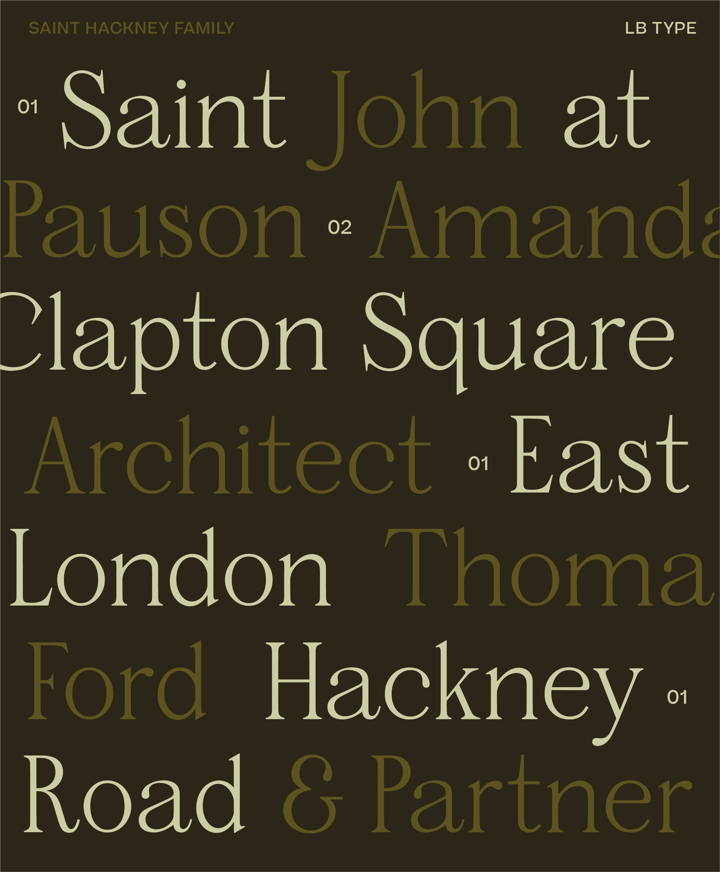
Saint Hackney is the newest display serif typeface from LB Type, drawing inspiration from the architectural restoration of Saint John at Hackney Church in East London by John Pawson. This elegant typeface bridges classical and contemporary design elements, featuring characteristics of both Transitional and Modern serif classifications, similar to historical typefaces like Baskerville and Bodoni.
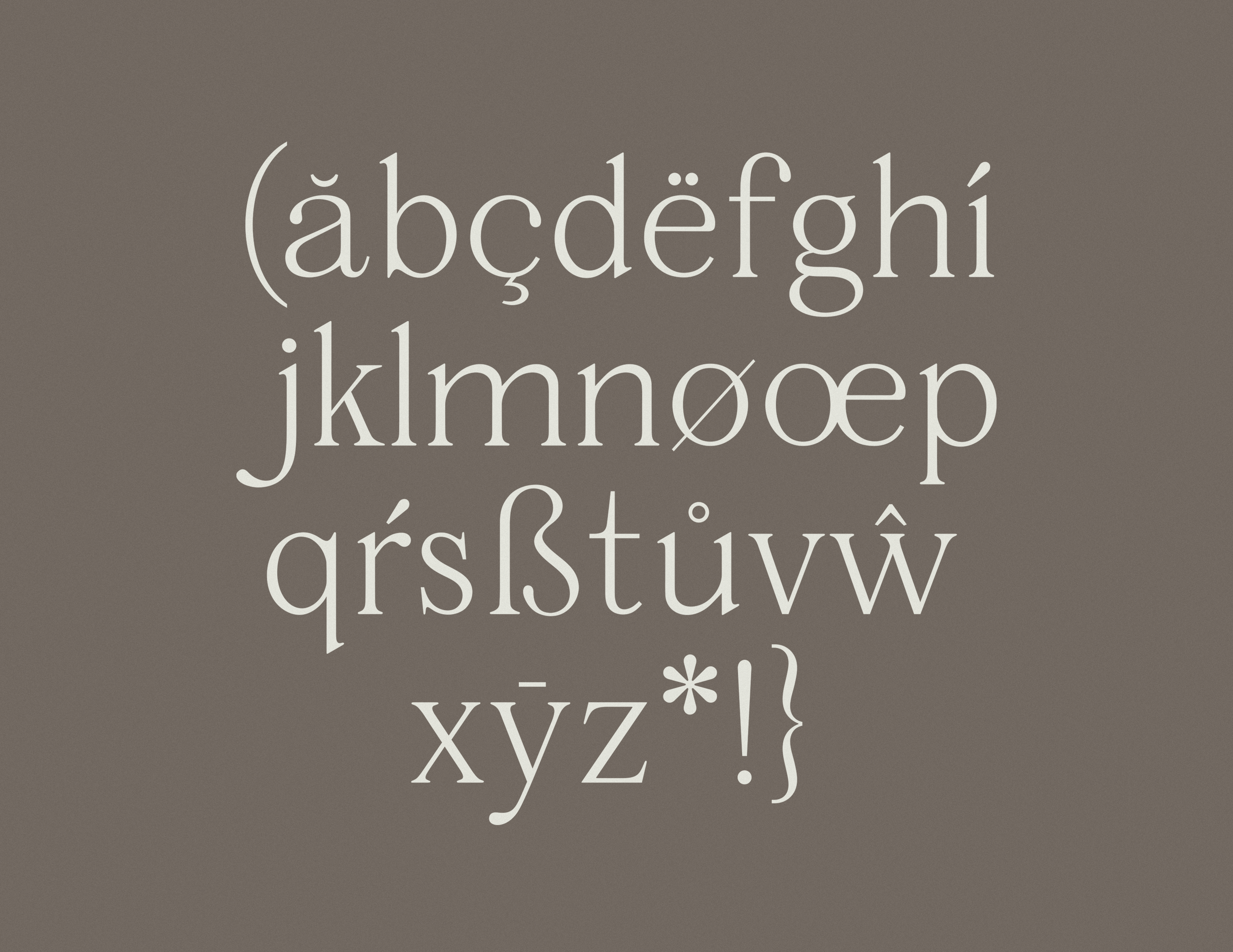
Distinguished by several unique characteristics, including its distinctive 'R' tail and Old Style-inspired lowercase 'a', Saint Hackney’s design philosophy mirrors Pawson's 2019 restoration of Saint John at Hackney Church, where nineteenth-century architectural elements harmoniously coexist with contemporary interventions. Similarly, Saint Hackney bridges historical and modern typographic elements, presenting itself as a typeface that feels both timeless and contemporary. As intended through the architectural restoration, the emphasis on functional beauty, multi-purpose use and reviving a space for community and sound to flourish, Saint Hackney’s letterforms similarly provide a versatile stage for various applications, making it perfectly suited for editorial design, branding, and creative installations where both heritage and modernity shall coexist.
-

LIGHT
-

REGULAR
-

MEDIUM
-

SEMIBOLD
-

BOLD
-

BLACK


CLASSIFICATION
Serif — Transitional/Modern
RELEASE
2025
VERSION
1.0
WEIGHTS
6 — Light, Regular, Medium, Semibold, Bold, Black
DESIGNER
Laura Bennett
Available in six carefully crafted weights from Light to Black, Saint Hackney demonstrates exceptional versatility across large and medium-sized applications. The typeface's high contrast between thick and thin strokes creates a dramatic interplay of light and shadow, reflective in the architectural principles of its namesake highlighting the delicate balance between preservation and renewal. This contrast is particularly evident in Saint Hackney’s heavier weights echoing Modern serif conventions reminiscent of Didot and Bodoni, while its lighter weights maintain clarity and sophistication with an emphasis on functionality.
DESKTOP
The licensed font can appear in commercial and personal projects including, but not limited to, physical end products, social media, broadcast, packaging, and paid ads. Please note, this license is measured by the company size not the number of users.
WEB
The licensed font can appear in a website owned or controlled by the Licensee. Pageview limit agreed upon at checkout.
MOBILE APP
This license permits use of the Licensed Asset in a single mobile app, desktop app, or video game title owned or controlled by Licensee.
For a publication license or a logo license please contact us for a custom quote.